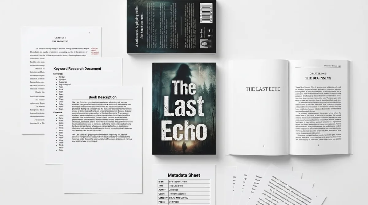
Book Cover Typography: Genre Fonts That Sell

Skip the theory? Generate a free book preview in about a minute — no signup, no card.
Try it freeBook cover typography is the part of a cover most authors underestimate until the thumbnail looks wrong. The art may be dramatic, the title may be strong, and the niche may be right — but if the type feels like a default font dropped on top of an image, shoppers read the whole book as less professional. Genre-fit typography solves a specific browsing problem: it tells the reader what kind of book this is, makes the title readable in Amazon search results, and gives the cover the confidence of a designed product instead of a generated asset.
This guide is not a list of pretty fonts. It is a working framework for choosing title typography by genre, testing thumbnail readability, avoiding common KDP cover mistakes, and knowing when a tool check is enough versus when a studio-level design pass is needed.
Why book cover typography affects sales
Typography affects sales because it works as a market signal before a shopper reads a single line of your blurb. In an Amazon search result, the title treatment is often the first clue a reader uses to decide, “Is this my kind of book?” If the typography looks familiar to the genre, the cover feels easier to trust. If it looks mismatched, the book can feel self-published in the wrong way even when the writing is solid.
Typography is genre shorthand
Readers do not analyze covers like designers do. They scan. In that scan, font style, weight, spacing, capitalization, texture, and placement tell a story fast. A sharp condensed title can suggest thriller. A softer serif can suggest romance or literary fiction. A geometric sans can suggest sci-fi. A rigid, high-contrast nonfiction layout can suggest authority. Typography is not decoration; it is part of the reader promise.
The key point: the right font name alone is not enough. A cover succeeds when font choice, letter spacing, weight, color contrast, and placement all work together. A plain typeface can look premium with strong hierarchy and spacing. A “fancy” typeface can fail if it is crowded, thin, or unreadable at thumbnail size.
Verified product fact: KDPBuilder selects genre-appropriate typography from a curated font intelligence system instead of defaulting to one generic font, because thumbnail readability is a purchase factor on Amazon.
Amazon shoppers judge covers at thumbnail size
Covers compete at search-result and also-bought thumbnail size, not only on the full product page. That changes every typography decision. A title that looks elegant at full size may disappear when reduced. A subtitle that feels useful in a design mockup may become noise on a phone screen.
For practical design work, assume the shopper sees your cover first at a very small size and only enlarges it if the cover earns that second look. The typography has to do two jobs at once: signal the genre immediately and remain readable inside a tiny frame.
That is the difference between a book that looks generated and a book that looks designed. A designed cover has clear hierarchy, enough contrast, and a title treatment that feels integrated with the artwork instead of floating above it. KDPBuilder’s position is simple: better output comes from a studio pipeline with editing, design, and QA gates — not from a bigger prompt. If you want to compare output quality before committing, judge the output yourself.
The default font problem
Default-looking typography is one of the fastest ways to make a cover feel low-trust. By default-looking, think system fonts used without modification, weak hierarchy, centered text pasted over art, poor spacing, and low contrast. The result is a cover that feels assembled instead of designed.
Why default fonts make covers look generated
Default typography creates distrust because it signals template use, low budget, or unedited AI output. Even if the cover image is strong, plain text dropped on top can make the whole book look unfinished. Readers may not know the design vocabulary, but they can sense when the title does not belong to the image.
This problem is common with AI-generated cover art. The image may be dramatic, polished, or cinematic, but the type looks pasted on afterward. The mismatch is easy to spot: the art suggests one level of craft, while the text suggests another. That disconnect can make the book feel amateur before the blurb gets a chance.
Verified product fact: KDPBuilder’s pipeline uses editing, design, and QA gates to produce books that look designed rather than generated.
The difference between a font and a title treatment
A font is only the starting material. A title treatment is the full system: font, size, alignment, spacing, case, contrast, placement, and how the title interacts with the art. Two covers can use the same font and look completely different because one has a deliberate title treatment and the other has text simply sitting on top of the image.
Think of it this way:
- Default font use looks like text placement.
- Professional title treatment looks like part of the cover architecture.
- Genre-fit typography looks like a buying signal.
A useful before-and-after check: if you remove the art and the title still has a clear visual personality, hierarchy, and genre cue, the typography is doing real work. If it becomes plain centered text with no structure, the cover is depending too heavily on the image.
If you want a related deep dive on the art side of this issue, see Why AI Book Covers Look Bad and How to Fix Them.
Book cover fonts by genre
Do not start with a generic font list. Start with genre expectations. The best type choices depend on what category your reader is browsing, what emotional promise the cover needs to make, and how much space the title has to work with.
Thriller and mystery fonts
Thriller covers usually benefit from condensed bold sans-serif type, tight spacing, and urgent stacked or vertical layouts. The point is speed and tension. Dark backgrounds, sharp contrast, and strong weight help the title hold up in thumbnail form.
Use typography that feels tense, not decorative. If the type is too soft, too spaced out, or too elegant, the cover can miss the genre cue. A thriller title should look like it wants attention immediately.
Romance fonts
Romance typography often leans elegant, emotional, and readable. Serif type can work well, and script accents can add mood when used carefully. The main title should remain easy to read; avoid making the core title so ornate that it becomes hard to parse on mobile.
Romance often depends on warmth and contrast rather than aggression. Softer spacing, graceful curves, and a balanced layout can help the cover feel inviting. If a script font is used, it is usually safer as an accent than as the only font carrying the title.
Fantasy fonts
Fantasy typography often uses custom serif forms, engraved details, or mythic-looking styling. The goal is to suggest worldbuilding, legend, or epic scale. Texture can help, but it should not overwhelm the letters.
One common mistake is over-ornamenting every letter. In thumbnail view, highly decorated letters can collapse into texture instead of words. Fantasy typography works best when it feels distinctive but still readable, especially at smaller sizes.
Sci-fi fonts
Sci-fi typography tends to favor geometric sans-serif forms, wide tracking, clean cuts, and high-contrast modern styling. Metallic, neon, or luminous effects can work if they support legibility rather than replacing it. The title should feel engineered, not cluttered.
Wide spacing can help sci-fi covers feel expansive or futuristic, but too much spacing can weaken the title at thumbnail size. The best sci-fi type often looks precise, controlled, and clean.
Nonfiction and business fonts
Nonfiction and business covers need authority first. Clean sans-serif or restrained serif typography usually works well because it supports clarity and trust. The layout should make the promise obvious fast, especially when the subtitle carries the topic.
For this category, hierarchy matters more than flourish. The reader wants to know what the book does, who it is for, and why it matters. If the typography looks clever but hides the message, it can hurt the cover’s usefulness.
Journals, workbooks, and activity books
Low-content journals and workbooks need utility-first title readability. The niche signal should be obvious, and the benefit text should be easy to scan. Decorative typography usually helps less than clear, direct communication.
For these covers, simplicity is not the enemy. A strong title, clear subtitle, and obvious purpose often outperform ornate styling because shoppers are looking for fast confirmation, not visual complexity.
| Genre | Typography pattern that usually fits | What to avoid |
|---|---|---|
| Thriller / Mystery | Condensed bold sans-serif, tight hierarchy, high contrast | Thin scripts, soft spacing, decorative flourishes |
| Romance | Elegant serif or restrained script accents | Over-ornate titles that lose readability on mobile |
| Fantasy | Distinctive serif or engraved styling with readable forms | Excessive ornament that turns words into texture |
| Sci-fi | Geometric sans-serif, clean cuts, controlled spacing | Cluttered effects that weaken legibility |
| Nonfiction / Business | Clean, authoritative type with strong subtitle hierarchy | Clever layouts that hide the topic |
| Journals / Workbooks | Clear title, obvious niche signal, practical subtitle | Decorative lettering that hides the use case |
Cover title readability at thumbnail size
Thumbnail readability is the test that matters most when your cover appears in search results, category shelves, or also-bought rows. If a stranger cannot read the title and identify the genre at a glance, the cover is not doing its job yet.
The 3-second thumbnail test
Use a 3-second test: show the cover to someone for three seconds and ask two questions only. Can they read the title? Can they tell what genre it is? If the answer to either question is no, the typography needs work.
This test matters because Amazon shoppers rarely inspect the cover at full size first. Most first impressions happen while scrolling. Your title treatment must survive that moment.
- Reduce the cover to about 160px wide.
- Check it again on a mobile screen.
- Ask whether the title is still the first thing the eye sees.
- Confirm the genre signal is still obvious.
- Fix spacing, contrast, weight, or placement if any answer is weak.
For a technical check before publishing, use the free KDP Cover Analyzer to see whether the design holds up.
Title, subtitle, and author hierarchy
Hierarchy means the reader knows what to read first, second, and third. In most cases, title comes first, subtitle second, and author name third. The exception is when the author name is the sales driver, such as a well-known brand or established series. For a new KDP title, the cover should usually lead with the book title.
A strong hierarchy often looks like this:
- Title: largest and highest contrast.
- Subtitle: smaller, but still legible and informative.
- Author name: clear, but visually subordinate unless brand recognition is the main asset.
Do not force equal emphasis on every line. Equal size makes everything compete, and competition kills clarity.
Contrast beats cleverness
At thumbnail size, contrast beats cleverness almost every time. A clever type effect that blends into the background is a weak title treatment. A simpler treatment with better contrast usually performs better visually because readers can process it faster.
That does not mean every cover must be plain. It means every design decision should support legibility first. Color contrast, weight, and placement should make the title unmistakable even when the cover is small.
Insider pro-tip: Before finalizing the design, print the cover thumbnail on plain paper at about 1 inch wide. If the title still reads instantly from arm’s length, your hierarchy is probably strong enough for Amazon browsing.
How to choose typography before designing the cover
Start with competing covers in the same Amazon category, not personal font taste. That single habit saves time and keeps the design tied to the market instead of to an abstract idea of what “looks nice.”
Audit the shelf before picking a font
Look at 10 to 20 competing covers in the category where your book will live. Notice repeated signals: title size, capitalization, font weight, texture, spacing, and subtitle placement. You are not copying anyone. You are learning the visual language the market already expects.
A simple audit process works well:
- Open the top-selling category pages for your target niche.
- Capture screenshots of 10 to 20 covers.
- Mark repeated typography patterns: weight, case, spacing, alignment, and contrast.
- Note which titles stay readable when reduced to thumbnail size.
- Write one sentence explaining how your cover can fit the shelf without blending into it.
Match reader expectation without copying competitors
Matching expectation means your typography should feel at home in the category, not identical to another author’s brand. Do not copy another cover’s type arrangement or branded series look. Instead, build your own version of the same genre language.
Create a typography brief before you choose final art. Include:
- Genre and subgenre
- Emotional promise
- Reader expectation
- Title length
- Subtitle importance
- Trim size
- Thumbnail goal
That brief gives you a decision filter. If a font looks attractive but does not support the brief, it is probably the wrong choice.
For published examples of how finished KDPBuilder projects use type as part of a full publishing package, study the Real Book Examples gallery.
Common typography mistakes on KDP covers
Most cover problems are not caused by one bad font alone. They come from a cluster of avoidable choices that weaken trust, readability, or genre fit.
Too many fonts
Using decorative fonts for every text element is a common mistake. One dominant title treatment is usually enough. When every line has a different personality, the cover loses cohesion and can feel messy.
A practical rule is to limit the cover to one primary font family and one supporting font at most, unless there is a clear design reason to do more. More variety does not automatically mean more professionalism.
Weak contrast
Thin fonts disappear quickly on dark or busy artwork. If the letters do not separate clearly from the background, the title loses power. Contrast should be checked in both light and dark viewing conditions because mobile screens vary.
If you must choose between a stylish but thin typeface and a heavier one that reads clearly, choose readability first. The reader should not have to work to find the title.
Bad spacing and unsafe margins
Print adds constraints that ebook covers do not have. For KDP print covers, bleed is typically 0.125 inches beyond the trim edge, and important text should stay inside safe margins rather than near the edge. If title elements sit too close to the border, cropping or print tolerance can create avoidable risk.
Also remember that KDP only allows spine text on paperback and hardcover covers when the book has at least 79 pages. If your interior is shorter than that, design the cover without relying on spine copy.
Unlicensed font use
Commercial licensing matters. A font that looks perfect for your cover still needs the right usage rights. Check the license before publication, especially if the design will appear across ebook, paperback, and marketing assets.
If you are unsure whether a font is licensed properly for commercial KDP use, verify it before you build the final cover files. A good-looking design is not worth a usage problem later.
| Mistake | What it signals | Better move |
|---|---|---|
| Centered text over art | Template or placeholder design | Rebuild hierarchy around the focal point |
| Thin title font | Low effort or low trust | Use stronger weight and higher contrast |
| Too many styles | Visual confusion | Limit to one dominant title treatment |
| Unsafe edge placement | Print risk | Keep key text inside safe margins |
| Unlicensed font | Commercial usage risk | Verify font rights before final files |
For a deeper print-spec check, see KDP Cover Requirements: Dimensions, Spine and DPI.
When to use KDP tools and when to use a studio
KDP tools are useful for checking readability, file preparation, and technical requirements, but they do not create genre strategy. They can tell you whether a cover is likely to pass a practical test, not whether it sends the right market signal.
Tools can test readability, not taste
Use KDP tools to catch problems such as poor thumbnail legibility, incorrect file sizing, or technical issues in your cover file. That is a valuable part of the process, but it is not the whole process. A technically correct cover can still feel wrong if the typography ignores genre expectations.
This is why typography should be evaluated alongside cover art, book positioning, subtitle, category, and sales page promise. All of those pieces work together. If one is off, the book can feel less credible even if the others are strong. When you are checking the visual side of that stack, the KDP Cover Analyzer is a practical first pass because it helps you inspect whether the design still reads at small sizes.
A designed book has a system
A professional publishing studio does more than place text on an image. It builds a system: idea, manuscript, cover, interior, metadata, and publish-ready files. Typography sits inside that system, not outside it. The goal is consistency from browse page to product page to open book.
If you want to use the current cover as a diagnostic step, test it in the KDP Cover Analyzer before publishing. That helps you catch size or readability problems early. Then review whether the title treatment still matches the genre promise after scaling.
KDPBuilder treats typography as part of publishing strategy, not as a decorative add-on. That matters because a good cover does more than look polished. It tells the shopper, quickly and clearly, what kind of book this is and why it belongs on their list. If you want to see the broader workflow behind that approach, the sample package shows how a studio pipeline handles the output.
Book cover typography checklist
Before you publish, run the cover through this short typography checklist:
- The title is readable at about 160px wide.
- The genre is recognizable within three seconds.
- The title, subtitle, and author name have a clear hierarchy.
- The typography matches the category shelf without copying another brand.
- There are no more than one primary font family and one support font unless the design has a clear reason.
- Text contrast survives dark backgrounds, busy art, and mobile viewing.
- Important text stays away from trim and bleed risk areas.
- Font licensing is appropriate for commercial book use.
FAQ
What is book cover typography?
Book cover typography is the choice, styling, and placement of the title, subtitle, and author text on a cover. It includes font selection, spacing, weight, color, hierarchy, and how the text interacts with the artwork. Good typography helps the cover communicate genre and remain readable at small sizes.
What are the best book cover fonts by genre?
There is no single best font that works for every book. Thriller often uses condensed bold sans-serif type, romance often uses elegant serif styling, fantasy often uses custom serif or engraved looks, sci-fi often uses geometric sans, and nonfiction usually benefits from clean, authoritative type. The best choice is the one that fits the category and stays readable in thumbnail view.
How do I test cover title readability at thumbnail size before publishing?
Use a 3-second test, then shrink the cover to about 160px wide and check it on a mobile screen. Ask whether the title is still readable and whether the genre is obvious. You can also run the design through the free KDP Cover Analyzer before you upload it.
Why do default fonts make a book cover look amateur?
Default fonts often signal that the design was left at the template stage. They usually come with weak hierarchy, poor spacing, centered text, and low contrast, which makes the cover feel generic or generated. Readers may not identify the problem in design terms, but they do register the lack of polish.
How many fonts should I use on a book cover?
Usually one dominant font family and one supporting font is enough. The goal is clarity, not variety for its own sake. Too many fonts create visual noise and make the cover feel less coherent.
Which KDP tools can help check whether my cover looks professional?
The KDP Cover Analyzer is a useful first check because it helps you evaluate whether the cover holds up visually and technically. It is best used as part of a larger review that includes genre fit, hierarchy, and thumbnail readability. KDP tools can catch issues, but they do not replace a full design strategy.
Final word
Good typography does not announce itself as clever. It makes the cover feel inevitable: the right genre, the right hierarchy, the right promise, readable in the exact place shoppers first see it. If your cover only works when viewed large, it is not finished yet.
Start with the free KDP cover and publishing tools to catch readability and production issues. Then compare your cover against real shelf examples and decide whether the type feels designed, not merely placed. If you want to see how KDPBuilder handles the full workflow from concept to publish-ready output, try free and judge the process for yourself.
Turn this idea into a book — free sample
Type a book idea and we'll generate a real cover preview in about a minute. No signup, no card.