Why AI Book Covers Look Bad (and How to Fix Them)

Skip the theory? Generate a free book preview in about a minute — no signup, no card.
Try it freeAI book covers look bad when a generated image is treated like a finished publishing asset. The giveaway is rarely just six fingers or a strange face. It is usually the whole system: unreadable type, confused genre signals, muddy contrast, weak composition, and a cover that falls apart the moment it appears as a small Amazon thumbnail.
The fix is not “write a better prompt” and hope. The fix is to stop judging the artwork by itself and start judging the cover the way a buyer sees it: title first, genre instantly, promise clearly, print file correctly built. If the cover cannot do those jobs, it is not ready for KDP.
Why AI book covers look bad
Many authors think why AI book covers look bad comes down to obvious generation errors: melted hands, warped eyes, or objects that do not make physical sense. Those mistakes matter, but they are the surface problem. The deeper problem is that the cover was never designed as a sales asset with hierarchy, category fit, thumbnail readability, and print production in mind.
A professional book cover is not just a picture. It is a package that has to do several jobs at once: attract the right reader, signal the correct genre in a split second, make the title readable at small size, and still work as a front-spine-back print file. When someone drops an AI image into a layout and calls it done, the result often feels cheap, random, or unfinished even if the artwork is technically impressive.
A cover is not an image file
A strong cover starts with a concept, not a prompt. The image is one layer. Around it, the designer makes deliberate decisions about title placement, subtitle size, font pairing, contrast, negative space, and how the book should sit beside competing titles in the same category.
That is why an image can look impressive in isolation and still fail as a cover. A dragon, a business desk, a romantic couple, or a cozy cottage may be beautifully rendered, but if the typography is weak or the category signal is wrong, the reader still skips it. The cover has to be legible, relevant, and commercially positioned.
The Amazon thumbnail test matters more than the full-size artwork
Many AI-generated covers look acceptable at full size, then collapse into visual noise on Amazon. Readers often see your book first as a thumbnail in search results, recommendation rows, ads, or category pages. At that size, the title, one clear focal point, and the genre signal carry most of the burden.
Use this simple test: shrink your cover until it is roughly postage-stamp size on your screen. If the title becomes unreadable, the image details blend together, or the category is unclear, the cover is not ready. A professional cover should communicate the book’s promise in two seconds or less.
If you want a faster diagnostic, run your draft through the KDP Cover Analyzer before you upload anything to KDP.
The most common AI generated cover problems
Most AI generated cover problems are visible before a shopper reads the book description. The image may have small artifacts or glaring mistakes, but the pattern is usually the same: the art is generated, while the cover is not designed.
Here are the issues readers notice fastest:
- Melted hands, extra fingers, or fingers that merge into props
- Warped objects such as cups, pens, books, weapons, furniture, or doorways
- Impossible anatomy, uneven eyes, or faces that feel slightly off
- Plastic skin, over-smoothed texture, or overly glossy lighting
- Fake depth, where foreground and background do not share the same perspective
- Inconsistent illustration styles within the same cover
- Random symbols, unreadable labels, or nonsensical details that invite a second look for the wrong reason
Those are the visible tells. The more damaging problems usually happen in typography, category fit, and hierarchy.
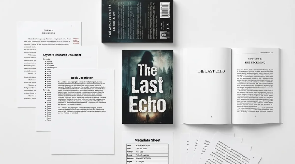
Product proof: KDPBuilder covers are produced as full wraps for the front, spine, and back at 300 DPI, with spine width calculated from the actual page count and paper type, then passed through a vision-based quality check before delivery. Browse real cover output.
Bad typography
Text is often the fastest way to spot a weak AI cover. Titles may be distorted, line breaks may feel awkward, letters may crowd together, and the font may not match the genre. A horror title in a playful rounded font, a romance title in a rigid techno font, or a business title in a decorative fantasy face sends the wrong signal immediately.
Professional covers use typography with intent. The title has a clear hierarchy. The author name is sized appropriately. The subtitle supports the promise of the book instead of competing with it. Spacing feels balanced. On a bad AI cover, the words are usually just placed on top of the art instead of being integrated into the design.
Wrong genre signals
Genre is a visual contract. If readers expect one thing and your cover suggests another, they hesitate. A cozy mystery that looks like epic fantasy, a business book that resembles a software launch page, or a children’s book with eerie facial expressions can lose clicks because the cover is making the shopper work too hard.
This is why many AI covers look amateur even when the rendering itself is decent. The system has not been forced to answer, “What market does this book belong to?” A professional workflow studies category conventions first, then creates something distinctive inside those conventions, not outside them.
To see the difference in market-ready output, compare your draft against the Customer Showcase or Real Book Examples rather than against generic AI art feeds.
Uncanny details
The uncanny problem is not limited to people. AI can also create objects that look almost right but not quite: a book with impossible page edges, jewelry that does not connect, a window whose perspective bends, or a landscape where the lighting disagrees with the shadows.
That matters because readers subconsciously trust covers that feel coherent. Even if they cannot name the flaw, they can feel that something is off. A slightly strange cover can make the book feel lower quality before the first page is opened.
No visual hierarchy
Good covers tell the eye where to go first, second, and third. Bad covers make every element shout at the same volume. The title competes with the background, the focal image competes with decorative effects, and the subtitle gets buried.
A practical rule: your cover should have one primary focal point, one secondary message, and one clear title zone. If every part of the cover is trying to be the star, nothing stands out.
Insider pro-tip: when a cover looks “AI-generated” but you cannot immediately say why, check the spaces between elements. Poor spacing around the title, author name, and focal image is one of the fastest ways to make a cover feel cheap even when the art itself is strong.
Why an AI book maker is not the same as a book builder
Many creators search for an AI book maker or AI book creator because they want speed. That is reasonable. But asset generation alone does not create a publish-ready book. A generated image is only one input. A book needs a publishing system around it.
That is the difference between a generator and a builder. A generator makes a piece of content. A book builder organizes the cover, interior, metadata, trim size, spine, and file output so the whole product works as a KDP listing, a printed paperback, and a thumbnail in Amazon search results.
Generators create assets
AI tools are useful for producing starting points: concepts, art directions, mood boards, rough visuals, and alternate treatments. But a generic image tool usually does not know your category, trim size, spine width, page count, paper type, or how your title will read at thumbnail scale. It may make something attractive, but not something publish-ready.
That limitation is important for authors who assume prompting can solve every design problem. Better prompting can improve the image. It cannot replace layout judgment, genre awareness, typography control, or production checks.
Studios make publishing decisions
A real publishing workflow asks different questions:
- Who is the reader, and what does that reader expect visually?
- What are the category conventions for this niche?
- How should the title and subtitle be arranged for easy reading?
- Does the cover still work at thumbnail size?
- Does the print file fit the correct trim, bleed, and spine requirements?
That is why KDPBuilder is best understood as a publishing studio rather than a prompt box. The goal is not simply to produce art. The goal is to build a coherent product: manuscript, cover, interior, metadata, and publish-ready files that support one another.
How designed covers differ from cheap AI covers
Designed covers are built in layers. They begin with market positioning, then move into concept direction, typography, color, image treatment, and file preparation. Cheap AI covers often reverse that order: first the image, then a rushed title overlay, then a best-effort attempt to make it look finished.
That difference is obvious on the sales page. A designed cover looks intentional because the reader can feel that each element was chosen for a reason.
Here is the stack a designed cover usually follows:
- Concept direction: the cover idea fits the promise of the book
- Market positioning: the design matches niche and category expectations
- Typography: fonts, sizing, spacing, and hierarchy are controlled
- Color palette: the colors support mood, contrast, and recognition
- Image treatment: the art is adjusted to fit the layout, not the other way around
- Layout grid: elements are aligned for balance and clarity
- Back cover and spine: the full wrap is consistent, not just the front
- File preparation: the output is sized correctly for KDP upload
Designed covers have a concept
A concept is not just a picture idea. It is a visual promise. A leadership book might use a clean compass, an upward path, or a decisive architectural shape. A thriller might use a single dramatic object with high contrast and controlled negative space. A cozy mystery might lean into warmth, charm, and one suspicious detail. The point is not decoration; the point is recognition.
Designed covers create a hook without confusing the reader. They signal the book’s category immediately and then add one distinctive element so the title becomes memorable.
Designed covers have controlled typography
Typography is where many cheap covers fall apart. Designers know how to make the title readable first and stylish second. They also know when to use all caps, when to tighten or loosen letter spacing, when to break a title over multiple lines, and when to keep the subtitle small enough that it supports rather than fights the main title.
A useful benchmark: if the font choice would look acceptable on a random poster but does not clearly communicate the book’s genre, it is probably the wrong font for the book.
Designed covers are built for the sales page
The cover does not live in a vacuum. It competes with search results, category pages, ads, recommendation rows, and adjacent books. A good design is built for that environment. It should be familiar enough to belong on the genre shelf and distinct enough to earn attention.
That is why product proof matters. Look at Real Book Examples and the Customer Showcase to see how finished covers can use AI-assisted workflows without looking generated. The issue is not whether AI touched the process. The issue is whether the final cover was designed as a publishing asset.
How to make book cover look professional before publishing
If you want to know how to make book cover look professional before publishing, focus on checks that improve the whole system, not just the art. A polished cover is usually the result of several small corrections: better hierarchy, stronger contrast, cleaner type, fewer distractions, and a print file that fits the book you are actually uploading.
Use this practical checklist before you publish on KDP:
- View the cover at thumbnail size and confirm the title is still readable
- Compare your cover against the top 20 books in your category
- Remove fake-looking details, warped anatomy, and cluttered props
- Simplify the palette to improve contrast and recognition
- Upgrade fonts so they match the genre and the book’s tone
- Strengthen the title contrast against the background
- Check whether the cover promise matches the interior content
- Review the full wrap, not only the front cover
Run the 2-second thumbnail test
Ask a simple question: can someone understand what this book is in two seconds? If not, the cover needs work. This does not mean every cover has to be minimal, but it does mean the main message must survive a small-screen view.
Try this with three zoom levels: full screen, half screen, and thumbnail size. If the title disappears at any one of those sizes, fix the hierarchy before moving on. Enlarge the title, reduce background detail, add contrast behind the text, or crop the focal image more aggressively.
Compare against real category leaders
Do not compare your cover to random beautiful images online. Compare it to books competing for the same reader. Study the fonts, color families, image styles, facial expressions, object choices, and spacing patterns that appear repeatedly in that niche.
This is where many AI covers fail. They may look visually interesting, but they do not resemble the category enough to earn trust. Readers want novelty inside a familiar frame, not a design that seems detached from the market.
Check the full KDP print file
For print books, the cover file is not just the front panel. Amazon KDP print covers need to account for the front cover, back cover, spine when applicable, and bleed if the design extends to the edge. Print cover files are commonly uploaded as PDF so the full wrap layout is preserved.
KDP print cover images should also be high resolution, with 300 DPI commonly recommended for professional print quality. This matters because soft or low-resolution art can make even a decent design look cheap once printed.
For paperbacks, KDP only allows spine text if the book has at least 79 pages. Books under that page count should not include spine text. If you add spine text too early, the book can look overdesigned or create avoidable file problems.
If you are still sorting out dimensions, spine width, and DPI requirements, read the sibling guide on KDP Cover Requirements: Dimensions, Spine & DPI. Then run your file through the KDP Cover Analyzer to catch problems before upload.
| What to check | Why it matters on KDP | Fast fix |
|---|---|---|
| Thumbnail readability | Most shoppers first see the book small in search results | Increase title size and contrast |
| Genre signal | Readers decide quickly whether the book belongs in their category | Match fonts, colors, and image cues to the niche |
| Full wrap setup | Print covers need front, spine, and back aligned correctly | Use actual page count and paper type for spine width |
| Print quality | Low-resolution files can look soft or cheap in paperback | Export high-resolution files, commonly 300 DPI |
| Text integration | Floating type makes the cover look assembled, not designed | Add a title zone, improve spacing, and reduce background clutter |
Where KDP tools help and where they do not
KDP tools are useful, but they have a boundary. They can help with diagnostics, sizing, templates, and workflow. They cannot replace taste, positioning, or genre judgment. That distinction matters because the hardest part of cover quality is not technical compliance; it is making the cover feel like it belongs in the right market.
In practice, the best workflow combines automation with review. Automation can speed up file setup and catch simple errors. Human judgment still has to decide whether the cover actually fits the reader.
Useful automation
Use tools for the tasks they handle well:
- Checking whether trim and bleed are set correctly
- Verifying spine placement and printable margins
- Spotting resolution issues before export
- Comparing your layout against KDP requirements
- Testing whether the cover remains readable at small sizes
Those checks prevent technical mistakes, but they do not tell you whether the cover looks like a convincing thriller, romance, memoir, business book, devotional, workbook, or children’s title.
Human-level design judgment
Design judgment is what separates a cover that looks assembled from one that looks considered. It includes decisions about restraint, balance, and audience fit. It also includes knowing when to make the art simpler so the title can do its job.
If you already know the cover feels risky but you are not sure why, diagnose it with the KDP Cover Analyzer. If you want to move from experimentation to a more coherent publishing workflow, Try KDPBuilder Free and compare how a built system differs from a one-off generated asset.
Product proof: KDPBuilder’s position is simple: stop publishing books that look generated, start building books that look designed. The difference is a studio pipeline with editing, design, and QA gates — not a bigger prompt. Judge the output yourself.
FAQ
Why do AI book covers look bad even when the image looks good?
Because the image is only one part of the cover. A strong cover also needs readable typography, correct genre signals, balanced spacing, and a layout that works at Amazon thumbnail size. A pretty image can still fail if the title is weak or the cover does not feel like it belongs in the category.
What are the biggest AI generated cover problems to check before uploading to KDP?
Check for warped hands, odd anatomy, distorted objects, inconsistent styles, weak contrast, and unreadable text. Then test the cover at thumbnail size and compare it with real books in the same niche. If the cover feels vague or confusing, it usually needs design work, not just a better prompt.
How can I make book cover look professional without hiring a full design team?
Start by simplifying the concept, using stronger fonts, improving contrast, and matching the genre more closely. Then review the full print wrap, not just the front cover, so spine, back cover, bleed, and margins are correct. You can also use the KDP Cover Analyzer to catch issues before upload.
Can an AI book creator make a publish-ready KDP cover?
Sometimes it can create a usable starting point, but a publish-ready cover usually needs additional design decisions. The tool can generate assets, but it cannot fully judge category fit, hierarchy, or sales-page performance. A real publishing workflow has to bring those pieces together.
What KDP tools can help me check whether my cover looks cheap?
The KDP Cover Analyzer is a good starting point because it helps diagnose layout and presentation problems before upload. You should also check your file against KDP cover requirements for dimensions, spine, DPI, and bleed. Those tools help with compliance, but you still need design judgment to make the cover feel credible.
Does Amazon KDP allow AI-generated book covers?
KDP does not have a blanket ban on AI-generated covers. The real issues are quality, rights, disclosure where required, and whether the cover meets KDP’s file and content expectations. A cover can be AI-assisted and still be suitable if it is designed well and prepared correctly for publication.
Before you publish, make the cover prove itself
A weak AI cover does not usually fail because the image is ugly. It fails because the cover has not been forced through the same checks a real publishing studio would use: category fit, thumbnail readability, typography, full-wrap production, and final QA.
Before you upload to KDP, put your cover under pressure. Shrink it. Compare it against category leaders. Check the spine. Inspect the type. Remove details that make readers pause for the wrong reason. If the cover still feels coherent after those tests, it is much closer to being publish-ready.
If you want to compare your current draft against a real publishing workflow, Try KDPBuilder Free and test the system before committing to a final file. If you want to judge the finished style first, review the sample package and use that output as your benchmark. New users can also explore the workflow with 75 free credits, no card required.
Turn this idea into a book — free sample
Type a book idea and we'll generate a real cover preview in about a minute. No signup, no card.